PayLane website: redesign
PayLane website redesign

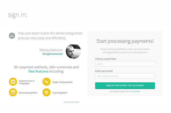
The sign-up process was completely reworked to include social proof and additional information about benefits:

Internal pages follow the pattern set on the main website, with layers of colour acting like seperators.

A new set of icons was designed. The largest set followed the trend of "long shadow" just to see how it worked.
